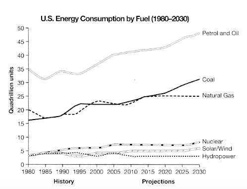
The line graph shows the consumption of six different energy sources in the United States from 1980 to 2030, with figures up to 2015 representing actual data and the remainder as projections.
Overall, petroleum and oil remained the dominant source throughout the period, followed by coal and natural gas. All other sources accounted for much smaller proportions, with solar/wind showing the most rapid growth in the later years, while hydropower stayed largely unchanged.
In 1980, petroleum and oil use stood at about 35 quadrillion units. After a slight decline in the mid-1980s, it rose steadily to roughly 45 units by 2015. Coal began at 16 units, climbed to 22 by the mid-1990s, levelled off for about a decade, and then increased to 25 units in 2015. Natural gas started at 20 units, fluctuated slightly with a peak of 23 in 2000, and reached 25 units by 2015, nearly matching coal. Nuclear power grew gradually from 5 to 8 units, solar/wind rose sharply after 2000 from near zero to around 5 units, and hydropower stayed in the 3–5 range.
By 2030, petroleum and oil are expected to reach nearly 50 units, while coal will rise to about 30, overtaking natural gas, which will remain stable at 25. Nuclear energy will increase modestly to 9 units, solar/wind will expand to about 7 units, and hydropower will remain unchanged.
Why This Works for Band 9
1. Introduction
The line graph shows the consumption of six different energy sources in the United States from 1980 to 2030, with figures up to 2015 representing actual data and the remainder as projections.
- Replaces “illustrates the how much” (incorrect grammar) with smooth, natural phrasing.
- Specifies the what, where, and when without redundancy.
- Clarifies past vs. projected data concisely.
2. Overview
Overall, petroleum and oil remained the dominant source throughout the period, followed by coal and natural gas. All other sources accounted for much smaller proportions, with solar/wind showing the most rapid growth in the later years, while hydropower stayed largely unchanged.
- Clear big picture without numbers.
- Highlights both ranking (petroleum/oil > coal > gas > others) and patterns (growth, stability).
- Shows examiner you can summarise trends, not just list data.
3. First detailed paragraph (1980–2015)
- Logical order: Highest → mid-level → smaller sources.
- Uses varied trend vocabulary: stood at, decline, rose steadily, climbed, levelled off, fluctuated, peaked, grew gradually, rose sharply, stayed.
- Figures are rounded for readability — avoids overcomplication with decimals.
4. Second detailed paragraph (2015–2030 projection)
- Starts with projection language: are expected to, will rise, will remain stable.
- Keeps data comparison clear: coal overtaking natural gas is explicitly noted.
- Maintains parallel structure for small sources (nuclear, solar/wind, hydropower).