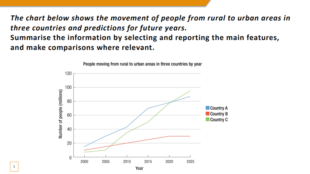
The line graph illustrates the number of people in three countries who preferred living in urban areas rather than rural areas between 2000 and the projected year 2025.
Overall, the proportion of urban residents increased in all three nations throughout the period, although the pace of growth varied. Country C experienced the most dramatic rise, while Country B consistently had the smallest share of city dwellers.
In 2000, approximately 10 million people in Country B lived in cities, compared with just under 3 million in Country A. At the same time, around 5 million citizens in Country C resided in urban areas. Over the following two decades, the number of urban residents in Country C rose exponentially, eventually catching up with Country A by 2020. In contrast, Country B showed only a gradual upward trend, with the urban population remaining significantly lower than the other two nations.
Looking ahead to 2025, the urban population in Country C is projected to soar to nearly 100 million, overtaking Country A, which is also expected to grow but more moderately, to just over 85 million. Meanwhile, the number of urban dwellers in Country B will remain comparatively stable, increasing only slightly and continuing to lag behind the other two nations.
IELTS Task 1 Improvements You Can Apply
🔹 Vocabulary for Trends
- rose steadily / grew gradually / climbed slightly
- experienced exponential growth / surged sharply / peaked at
- remained stable / showed only a slight increase / lagged behind
🔹 Comparisons
- “Compared with…”
- “In contrast…”
- “While A rose sharply, B remained stable…”
- “Country C overtook Country A by 2025…”
🔹 Structure Reminder
- Body 2 – projections/future OR later years
- Intro – paraphrase the task
- Overview – main trends (Band 9 MUST)
- Body 1 – past data comparisons