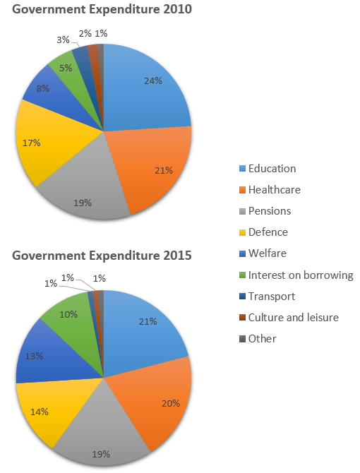
The charts illustrate the proportion of government expenditure allocated to nine categories in 2010 and 2015. Over this period, notable shifts occurred, with reductions in most major sectors and increases in borrowing costs and welfare.
In both years, education, healthcare, pensions, and defence absorbed the largest shares of the budget, with education leading at 24% in 2010 and 21% in 2015. At the opposite end, transport, culture and leisure, and “other” consistently accounted for the smallest proportions, while welfare and interest on borrowing fell in the mid-range.
Between 2010 and 2015, spending declined across all major categories except pensions, which remained unchanged at 19%. Transport and culture and leisure experienced particularly steep falls, with the transport allocation reduced by two-thirds. In contrast, welfare expenditure rose considerably, and the cost of interest on borrowing doubled to 10%.
Overall, the data suggest a reallocation of resources away from traditional public services towards meeting debt obligations and expanding welfare provision.