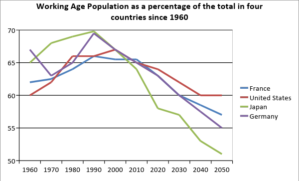
The line graph compares the proportion of working-age adults in France, the United States, Japan, and Germany from 1960 to 2015, with projections extending to 2050.
Overall, Japan and Germany consistently recorded higher proportions of working-age adults than the United States and France until around the early 2000s. However, both countries are projected to experience sharp declines in their labour-force-aged populations, while the US and France will also see gradual downward trends.
In 1960, Japan and Germany each had just over 60% of their populations in the working-age bracket. Both figures climbed steadily, peaking at about 70% in 1990, before starting to fall. By 2050, Germany’s proportion is expected to decline to around 55%, while Japan’s will drop to just above 50%, with minor fluctuations along the way.
By contrast, the US share rose slightly from 60% in 1960 to approximately 67% in 2000, then levelled off before beginning a gradual projected decline. France followed a similar path, increasing from roughly 63% to over 65% before falling steadily, reaching just above half by 2050.
let’s break down the Band 9 version sentence by sentence so you can see exactly why each part works and how to reproduce it in your own IELTS Task 1 writing.
1. Introduction
The line graph compares the proportion of working-age adults in France, the United States, Japan, and Germany from 1960 to 2015, with projections extending to 2050.
Why it works for Band 9
- Paraphrasing: “Shows” → “compares” (more academic); “percentage” → “proportion” (varied vocabulary).
- Complete scope: Includes time span (1960–2015) and mentions that data extends to 2050 (projections).
- One concise sentence: No repetition of country names later in the sentence — avoids wordiness.
2. Overview
Overall, Japan and Germany consistently recorded higher proportions of working-age adults than the United States and France until around the early 2000s. However, both countries are projected to experience sharp declines in their labour-force-aged populations, while the US and France will also see gradual downward trends.
Why it works for Band 9
- Clear trends: Covers both historical and future patterns in one overview.
- Comparative structure: “Higher… than…” shows you’re comparing data (key for Task Achievement).
- Balanced detail: States that all countries will decline, but differentiates between “sharp” and “gradual.”
- No numbers in the overview (IELTS examiners prefer an overview that focuses on patterns, not data).
3. First detailed paragraph
In 1960, Japan and Germany each had just over 60% of their populations in the working-age bracket. Both figures climbed steadily, peaking at about 70% in 1990, before starting to fall. By 2050, Germany’s proportion is expected to decline to around 55%, while Japan’s will drop to just above 50%, with minor fluctuations along the way.
Why it works for Band 9
- Logical grouping: Japan and Germany are discussed together because their trends are similar.
- Varied vocabulary: “Climbed steadily,” “peaking,” “decline,” “drop” — avoids repetition of “increase” and “decrease.”
- Data precision: Approximate figures (“about 70%,” “around 55%”) show accuracy without overloading with decimals.
- Future projection language: “Is expected to,” “will drop” — matches the chart’s forecast data.
4. Second detailed paragraph
By contrast, the US share rose slightly from 60% in 1960 to approximately 67% in 2000, then levelled off before beginning a gradual projected decline. France followed a similar path, increasing from roughly 63% to over 65% before falling steadily, reaching just above half by 2050.
Why it works for Band 9
- Cohesive linking: “By contrast” signals a shift to countries with different trends.
- Variation in trend description: “Rose slightly,” “levelled off,” “gradual projected decline” — all describe change with precision.
- Parallel structure: France’s sentence mirrors the US’s trend for readability and comparison.
- End focus: The last clause gives a striking final figure (“just above half by 2050”), leaving a clear takeaway.