Introduction
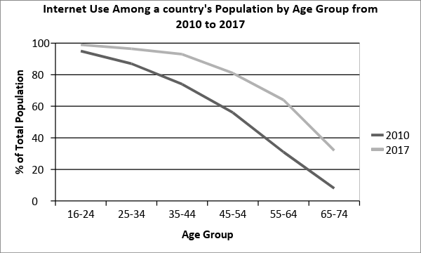
The given line graph compares and contrasts the internet usage among different age groups in a country in the years 2010 and 2017. (Start by paraphrasing the question to clearly introduce what(at least two WH question) the graph shows; this is a neutral, factual statement and sets the context.)
Overview
Overall, internet usage increased in every age category over the given period. (State the general trend first; this gives the examiner a clear “big picture” summary.) Additionally, younger age groups consistently recorded higher levels of internet access, whereas older people were less likely to use the internet, despite noticeable growth. (Highlight the main differences or patterns between age groups; this shows comparison and contrast without going into data yet.)
Body Paragraph 1 (16–44 age group)
To begin with (connective to start first body paragraph), internet usage peaked in the youngest age group and then gradually declined with increasing age in both years (present the main trend or feature first; makes paragraph clear and logical). Internet penetration was almost universal among those aged 16–24 (support the trend with evidence), in 2010 and 2017, at approximately 95% and 99% respectively (put dates and numbers at the end for clarity and readability). Nevertheless, a slight decline was observed among people aged 25–34 (showing comparison with the previous age group), in 2010 and 2017, at around 90% and 95% respectively (quantify the trend clearly). A further downward pattern was evident among the 35–44 age group (continuing logical flow of age-related decline), with internet usage falling by roughly 10 percentage points compared to the previous group (highlighting the change without repeating data unnecessarily).
Body Paragraph 2 (45–74 age group)
Turning to the older age groups (connective to start second body paragraph), internet usage was significantly lower compared to younger users (highlight contrast between groups; helps cohesion and comparison). In 2010, around 65% of individuals aged 45–54 used the internet (present starting point of trend), before declining sharply among those aged 55–64 and 65–74 (show the downward trend clearly), at approximately 40% and 20% respectively in 2010 (end sentence with data for clarity). However, by 2017 (introduce time-based comparison), internet usage increased substantially across all these age groups (summarise overall change in older groups), reaching nearly 85%, 75%, and 45% respectively (end with precise figures for examiner clarity).