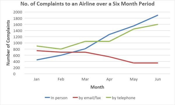
The line graph compares the number of complaints made to an airline’s complaint department through three different channels—personal delivery, telephone, and fax or email—during the first half of 2009.
Overall, spoken complaints (in person and by telephone) increased notably over the period, while written complaints (fax and email) declined steadily.
Face-to-face complaints showed the most dramatic rise. Starting as the least common method with around 400 complaints in January, personal complaints surpassed all others by mid-March and continued to climb, reaching over 1,900 by June—an almost fivefold increase. Telephone complaints began at approximately 900 in January, fluctuated slightly in the first few months, then surged after April to reach 1,600 by June. Conversely, complaints via fax or email remained stable at about 800 during the first quarter before halving to just under 400 by mid-year.
Paragraph-by-Paragraph Breakdown
Paragraph 1 – Introduction
- Paraphrases the prompt, clearly stating the time frame and complaint channels.
- Precise, natural wording (“channels” instead of “means,” “first half” instead of “during the first half”).
Paragraph 2 – Overview
- Provides an accurate summary of the main trends without specific data points.
- Clear distinction between spoken and written complaint trends using good vocabulary (“notably,” “steadily”).
Paragraph 3 – Details
- Describes each complaint method logically, starting with face-to-face, then telephone, then written.
- Uses a wide range of expressions to describe trends and figures (“most dramatic rise,” “fluctuated slightly,” “surged,” “halving”).
- Includes comparative language (“surpassed all others,” “conversely”).